3D Card Hover Effects with HTML, CSS & JavaScript
Introduction
Adding interactive and visually appealing elements to your website can drastically improve user experience. One such element is the 3D Tilt & Parallax Card Hover Effect — a slick animation that responds to your mouse movements, giving your card depth, motion, and realism. In this post, I’ll show you how I created this beautiful 3D card using just HTML, CSS, and vanilla JavaScript.
🎯 What This Project Does
This 3D Card Hover project is a visual UI effect that combines the following animations:
✅ Tilt Animation — the card rotates in real-time based on mouse movement.
✅ Parallax Background — the background image shifts slightly, enhancing depth.
✅ Floating Image (Parallax Layer) — the product image moves independently from the background.
✅ Shine Effect — a glowing gradient follows the cursor on hover.
It’s perfect for showcasing products, portfolios, or even interactive UI cards on landing pages.
🧱 Technologies Used
- HTML5 — for structure
- CSS3 — for 3D effects, shine, and styling
- JavaScript (vanilla) — for real-time mouse tracking and transformations
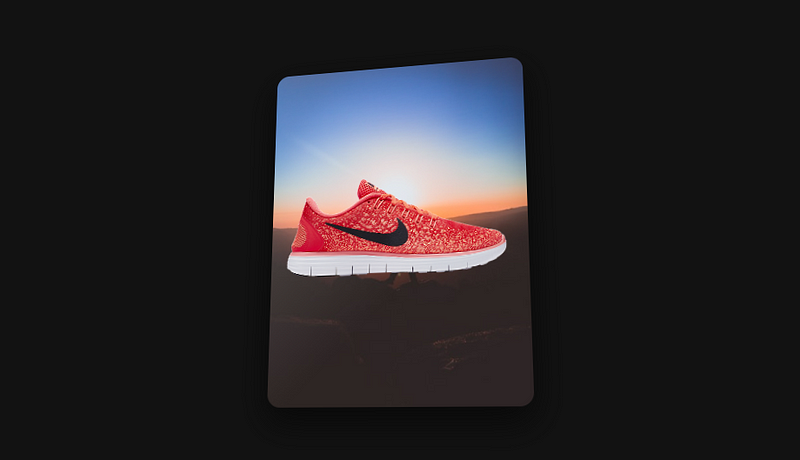
🖼️ Final Output Preview
When you hover over the card, it smoothly tilts and animates with a glowing shine and layered motion like this:
Hover over the shoe image — it feels alive.
HTML Structure
<div class="card">
  <img src="https://res.cloudinary.com/arwinneil/image/upload/v1525614947/product2_ce8vch.png" alt="Nike Shoe" class="card-img">
</div
Just a div with a class card, and an image inside it — clean and minimal!
🎨 CSS Styling with 3D Effects
.card {
  width: 300px;
  height: 400px;
  background: url('your-background.jpg') no-repeat center/cover;
  border-radius: 15px;
  transform-style: preserve-3d;
  box-shadow: 0 15px 35px rgba(0,0,0,0.5);
  transition: transform 0.3s ease, background-position 0.5s ease;
  cursor: pointer;
  position: relative;
  overflow: hidden;
}
.card::before {
  content: '';
  position: absolute;
  top: 0; left: 0;
  width: 100%; height: 100%;
  background: linear-gradient(135deg, rgba(255,255,255,0.3), rgba(255,255,255,0));
  opacity: 0;
  transition: opacity 0.3s ease;
  border-radius: 15px;
}
.card:hover::before {
  opacity: 0.8;
}
The shine effect is created with a pseudo-element and a gradient that lights up on hover.
⚙️ JavaScript: Tilt, Parallax, and Motion Logic
const card = document.querySelector(".card");
card.addEventListener("mousemove", (e) => {
  const rect = card.getBoundingClientRect();
  const x = e.clientX - rect.left - rect.width / 2;
  const y = e.clientY - rect.top - rect.height / 2;
  const rotateX = (y / rect.height) * -30;
  const rotateY = (x / rect.width) * 30;
  card.style.transform = `perspective(1000px) rotateX(${rotateX}deg) rotateY(${rotateY}deg)`;
  const bgX = (x / rect.width) * 25 + 50;
  const bgY = (y / rect.height) * 25 + 50;
  card.style.backgroundPosition = `${bgX}% ${bgY}%`;
  const img = card.querySelector(".card-img");
  if (img) {
    const imgX = (x / rect.width) * -20;
    const imgY = (y / rect.height) * -20;
    img.style.transform = `translate(calc(-50% + ${imgX}px), calc(-50% + ${imgY}px)) translateZ(50px)`;
  }
});
card.addEventListener("mouseleave", () => {
  card.style.transform = 'perspective(1000px) rotateX(0deg) rotateY(0deg)';
  card.style.backgroundPosition = '50% 50%';
  const img = card.querySelector(".card-img");
  if (img) {
    img.style.transform = 'translate(-50%, -50%) translateZ(50px)';
  }
});
This JS script captures mouse movement inside the card and applies 3D transforms. It even moves the image separately to create a real parallax effect.
✅ Conclusion
This project is a perfect blend of design and interactivity — ideal for:
- Product showcases (e.g. shoes, gadgets, fashion)
- UI/UX design portfolios
- Animated hero sections
You don’t need heavy libraries or frameworks — just plain HTML, CSS, and JS. Lightweight and responsive!
💡 Bonus Idea:
You can expand this by:
- Adding multiple cards in a grid
- Triggering click effects or tooltips
- Loading data dynamically for reusable cards
Comments
Post a Comment