Real-Time Clock with Dark Mode Toggle
In today’s digital world, interactive web elements that combine functionality with user experience are increasingly popular. A simple yet elegant clock with the option to switch between light and dark modes offers both practical utility and aesthetic appeal. This blog post walks through creating a responsive real-time clock with a dark mode toggle using HTML, CSS, and JavaScript.
Project Overview
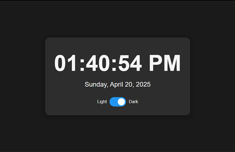
The real-time clock application features:
- Live time display that updates every second
- Current date display in a user-friendly format
- A toggle switch for switching between light and dark modes
- Mode preference storage using localStorage
- Smooth transitions between modes
- Responsive design for various devices
The HTML Structure
The foundation of our clock is a simple HTML structure that organizes our elements:
<!DOCTYPE html>
<html lang="en">
<head>
    <meta charset="UTF-8">
    <meta name="viewport" content="width=device-width, initial-scale=1.0">
    <title>Real-Time Clock with Dark Mode</title>
    <!-- CSS goes here -->
</head>
<body>
    <div class="container">
        <div class="time" id="time">00:00:00</div>
        <div class="date" id="date">Monday, January 1, 2023</div>
        <div class="toggle-container">
            <span class="mode-label">Light</span>
            <label class="toggle">
                <input type="checkbox" id="dark-mode-toggle">
                <span class="slider"></span>
            </label>
            <span class="mode-label">Dark</span>
        </div>
    </div>
    <!-- JavaScript goes here -->
</body>
</html>
The structure consists of a main container that holds the time display, date display, and mode toggle. The toggle utilizes a checkbox input paired with styled elements to create a sliding switch effect.
Styling with CSS
The CSS provides both aesthetics and responsiveness:
body {
    font-family: 'Arial', sans-serif;
    display: flex;
    flex-direction: column;
    justify-content: center;
    align-items: center;
    min-height: 100vh;
    background-color: #f5f5f5;
    color: #333;
}
.container {
    text-align: center;
    padding: 2rem;
    border-radius: 1rem;
    box-shadow: 0 4px 20px rgba(0, 0, 0, 0.1);
    background-color: #fff;
    min-width: 320px;
}
.time {
    font-size: 5rem;
    font-weight: bold;
    margin: 1rem 0;
}
.date {
    font-size: 1.5rem;
    margin-bottom: 2rem;
}
Key CSS features include:
- Flexbox centering to position the clock in the middle of the viewport
- Box shadows and border-radius for a modern, card-like appearance
- Responsive font sizes for different screen sizes
- Transition effects for smooth mode switching
The toggle switch styling uses pseudo-elements to create the sliding circle effect:
.toggle {
    position: relative;
    display: inline-block;
    width: 60px;
    height: 34px;
}
.slider {
    position: absolute;
    cursor: pointer;
    top: 0;
    left: 0;
    right: 0;
    bottom: 0;
    background-color: #ccc;
    border-radius: 34px;
    transition: .4s;
}
.slider:before {
    position: absolute;
    content: "";
    height: 26px;
    width: 26px;
    left: 4px;
    bottom: 4px;
    background-color: white;
    border-radius: 50%;
    transition: .4s;
}
input:checked + .slider {
    background-color: #2196F3;
}
input:checked + .slider:before {
    transform: translateX(26px);
}
The dark mode styles modify the color scheme when activated:
body.dark-mode {
    background-color: #1a1a1a;
    color: #f5f5f5;
}
body.dark-mode .container {
    background-color: #2d2d2d;
    box-shadow: 0 4px 20px rgba(0, 0, 0, 0.3);
}
JavaScript Functionality
The JavaScript brings our clock to life with real-time updates and interactive features:
javascript// Elements
const timeElement = document.getElementById('time');
const dateElement = document.getElementById('date');
const darkModeToggle = document.getElementById('dark-mode-toggle');
// Format options
const timeOptions = { hour: '2-digit', minute: '2-digit', second: '2-digit', hour12: true };
const dateOptions = { weekday: 'long', year: 'numeric', month: 'long', day: 'numeric' };
// Update time function
function updateClock() {
const now = new Date();
// Update time display
timeElement.textContent = now.toLocaleTimeString(undefined, timeOptions);
// Update date display
dateElement.textContent = now.toLocaleDateString(undefined, dateOptions);
}
// Toggle dark mode
function toggleDarkMode() {
document.body.classList.toggle('dark-mode');
// Save preference to localStorage
const isDarkMode = document.body.classList.contains('dark-mode');
localStorage.setItem('darkMode', isDarkMode);
}
// Check for saved preference
const savedDarkMode = localStorage.getItem('darkMode') === 'true';
if (savedDarkMode) {
document.body.classList.add('dark-mode');
darkModeToggle.checked = true;
}
// Event listeners
darkModeToggle.addEventListener('change', toggleDarkMode);
// Initial call and set interval
updateClock();
setInterval(updateClock, 1000);The JavaScript accomplishes several important tasks:
- Time and Date Formatting: Using
toLocaleTimeString()andtoLocaleDateString()with formatting options to display time and date according to the user's locale. - Real-Time Updates: The
setInterval()method calls theupdateClock()function every second to keep the display current. - Dark Mode Toggle: The toggle switch adds or removes the ‘dark-mode’ class from the body element to change the theme.
- Persistence: The user’s theme preference is saved in
localStorageand retrieved when the page loads again.
User Experience Considerations
Several elements enhance the user experience:
- Smooth Transitions: CSS transitions create a gentler switch between light and dark modes, reducing visual jarring.
- Responsive Design: The layout adapts to different screen sizes while maintaining readability.
- Preference Memory: The application remembers the user’s theme preference, providing a consistent experience across visits.
- Accessible UI: The toggle includes text labels for clarity and the interface maintains sufficient contrast in both modes.
Potential Enhancements
This clock project could be extended with additional features:
- Adding time zone selection options
- Implementing custom theme colors
- Creating alarm or timer functionality
- Adding animations for time changes
- Incorporating weather data to create a more comprehensive dashboard
Conclusion
This real-time clock with dark mode toggle demonstrates how combining simple HTML, CSS, and JavaScript can create an effective, user-friendly web application. The project balances functionality, aesthetics, and user experience while maintaining clean, organized code. By understanding the principles behind this implementation, you can adapt and extend these techniques for more complex web applications.
Comments
Post a Comment