Card Hover Effects: Creating Elegant Interactive Elements with CSS
In today’s web design landscape, interactive elements not only enhance user experience but also create visual interest that keeps visitors engaged. One of the most effective UI elements is the hover card — a simple yet powerful component that reveals additional information when a user interacts with it. Let’s explore a beautiful implementation of card hover effects using HTML and CSS.

The Design Concept
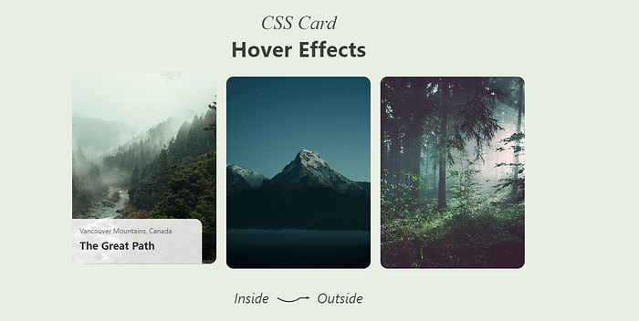
This project features a collection of nature-themed cards with smooth hover animations. Each card displays a stunning landscape image that subtly zooms in when hovered, while additional content elegantly slides up from the bottom. The design embraces a clean, minimalist aesthetic with a natural color palette.
Key Features
- Smooth Transform Animations: Cards slightly lift up when hovered
- Image Zoom Effect: Images subtly scale up on interaction
- Content Reveal: Information slides up from below with a fade-in effect
- Responsive Design: Adapts beautifully to different screen sizes
- Clean Typography: Well-balanced text hierarchy enhances readability
The HTML Structure
The HTML structure is straightforward and semantic:
<div class="cards-container">
    <div class="card">
        <img src="1.png" alt="Misty forest with a river flowing through mountains">
        <div class="card-content">
            <p class="location">Vancouver Mountains, Canada</p>
            <h3 class="title-card">The Great Path</h3>
        </div>
    </div>

    <!-- Additional cards follow the same pattern -->
</div>
Each card consists of an image and a content container that holds location information, a title, and occasionally a call-to-action button.
The CSS Magic
The real magic happens in the CSS. Let’s examine the key styling techniques that create these effects:
.card {
    position: relative;
    width: 300px;
    height: 400px;
    border-radius: 15px;
    overflow: hidden;
    cursor: pointer;
    transition: transform 0.3s ease;
}
.card:hover {
    transform: translateY(-10px);
}
.card img {
    width: 100%;
    height: 100%;
    object-fit: cover;
    transition: transform 0.5s ease;
}
.card:hover img {
    transform: scale(1.05);
}
.card-content {
    position: absolute;
    bottom: 0;
    left: 0;
    width: 90%;
    background: rgba(255, 255, 255, 0.85);
    padding: 15px;
    border-top-right-radius: 15px;
    transform: translateY(100%);
    transition: transform 0.5s ease;
    opacity: 0;
}
.card:hover .card-content {
    transform: translateY(0);
    opacity: 1;
}
Breaking Down the Techniques
Card Container Setup
- The
position: relativeon the card creates a positioning context for absolute elements overflow: hiddenensures that zoomed images don't spill outside the card- The border-radius creates soft, rounded corners
Lift-Up Effect
- A simple
transform: translateY(-10px)creates the illusion of the card lifting up - The transition property ensures this happens smoothly over 0.3 seconds
Image Zoom
- Images scale up to 105% of their original size on hover
- The transition is slightly slower (0.5s) than the card lift for a more natural feel
Content Reveal
- Content starts below the visible area with
transform: translateY(100%) - On hover, it slides up with
transform: translateY(0) - Opacity transitions from 0 to 1 for a fade-in effect
- The semi-transparent white background ensures text remains readable over any image
Thoughtful Details
- The content panel only takes 90% width, creating an asymmetrical design
- The top-right border radius on the content panel adds visual interest
- Text alignment is left-justified for better readability
Responsive Considerations
The design adapts to different screen sizes with media queries:
@media (max-width: 768px) {
    .card {
        width: 280px;
        height: 350px;
    }
    /* Other adjustments */
}
@media (max-width: 480px) {
    .card {
        width: 100%;
        max-width: 300px;
        height: 320px;
    }
    /* Font size adjustments */
}
This ensures the cards look good on tablets and mobile devices while maintaining their interactive functionality.
Conclusion
This card hover effect demonstrates how subtle animations can significantly enhance user experience. The combination of multiple transitions — lifting, zooming, and revealing — creates a multi-dimensional effect that feels natural and engaging.
Comments
Post a Comment