In today’s digital world, captivating visual elements can dramatically enhance user experience on websites and applications. Among these elements, CSS animations have emerged as a powerful tool for creating engaging interfaces without relying on heavy JavaScript libraries or plugins. In this article, I’ll walk you through a beautiful glowing ring animation project created using only HTML and CSS, explain how it works, and discuss its practical applications.
The Glowing Ring Animation Project
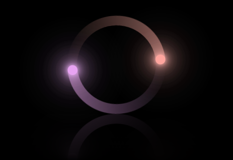
This project creates mesmerizing animated glowing rings that rotate continuously, producing an eye-catching visual effect. The animation features smoothly rotating semi-transparent gradients combined with brilliantly glowing dots that orbit around the circular elements. The final result is both aesthetically pleasing and technically impressive, especially considering it’s built with pure CSS.
How It Works: Breaking Down the Code
The Basic Structure
The HTML structure for this animation is surprisingly simple:
<div class="loader-container loader-container2">
  <div class="loader loader1"><span></span></div>
  <div class="loader loader2"><span></span></div>
  <div class="loader loader3"><i></i></div>
  <div class="loader loader4"><i></i></div>
</div>
This structure consists of a container that houses four loader elements, each serving a specific purpose in creating the complete animation effect.
CSS Magic
The key to this animation lies in the CSS properties applied to these simple HTML elements:
- The Rotating Animation: The continuous rotation is achieved with a simple keyframe animation:
@keyframes animate {
  0% { transform: rotate(0deg); }
  100% { transform: rotate(360deg); }
}- Creating the Ring Effect: The semi-circular appearance comes from pseudo-elements with carefully crafted gradients:
.loader1:before, .loader2:before {
  content: "";
  position: absolute;
  top: 0;
  left: 0;
  width: 50%;
  height: 100%;
  background: linear-gradient(to top, transparent, rgba(0, 255, 249, 0.4));
  background-size: 100px 180px;
  background-repeat: no-repeat;
  border-top-left-radius: 100px;
  border-bottom-left-radius: 100px;
}- The Glowing Dots: Small circular elements with extensive box-shadow properties create the glowing effect:
.loader i {
  position: absolute;
  top: 0;
  left: 50%;
  transform: translateX(-50%);
  width: 20px;
  height: 20px;
  background: #00fff9;
  border-radius: 50%;
  z-index: 100;
  box-shadow: 0 0 10px #00fff9, 0 0 20px #00fff9, 0 0 30px #00fff9,
    0 0 40px #00fff9, 0 0 50px #00fff9, 0 0 60px #00fff9, 0 0 70px #00fff9,
    0 0 80px #00fff9, 0 0 90px #00fff9, 0 0 100px #00fff9;
}- The Reflection Effect: A subtle touch that adds depth is the reflection beneath the animation
.loader-container {
  -webkit-box-reflect: below 0 linear-gradient(transparent, transparent, rgba(0, 0, 0, 0.333));
}
Practical Applications for This Animation
This CSS glowing ring animation has numerous practical applications in modern web design:
1. Loading Indicators
The most obvious application is as a stylish loading indicator. When users need to wait for content to load, this animation provides visual feedback that processes are running in the background. Its hypnotic movement keeps users engaged during what would otherwise be a frustrating waiting period.
2. Hero Section Backgrounds
For websites with a futuristic or tech-oriented theme, this animation can serve as an impressive background element for hero sections. Its motion draws the eye while still allowing text overlay to remain readable.
3. Interactive UI Elements
The animation can be incorporated into interactive elements that respond to user actions. For example, it could expand when a button is hovered over or activate when a form is submitted.
4. Portfolio Showcases
For designers and developers, this animation demonstrates CSS proficiency and can serve as an impressive portfolio piece that showcases animation skills.
5. Gaming Websites
For gaming websites or applications, these glowing rings could represent power-ups, energy levels, or other game metrics in an aesthetically pleasing way.
Technical Benefits
Beyond its visual appeal, this project offers several technical advantages:
- Lightweight Performance: Since it uses only CSS without JavaScript, it loads quickly and runs smoothly even on less powerful devices.
- Customizable: By adjusting a few CSS values, you can completely change the colors, sizes, speeds, and overall appearance of the animation.
- Browser Compatibility: The core animation works across all modern browsers, though some effects like the reflection may require vendor prefixes for full compatibility.
- No Dependencies: The animation doesn’t rely on any external libraries or frameworks, making it easy to integrate into any project.
Expanding the Project
There are several ways to enhance this animation further:
- Responsive Sizing: Adding media queries would allow the animation to adapt gracefully to different screen sizes.
- Interactive Elements: JavaScript could be added to make the rings respond to mouse movements or clicks.
- Multiple Color Themes: As already demonstrated with the pink variant, different color schemes can be easily applied to match various brand identities.
- Sound Integration: For an even more immersive experience, audio feedback could be synchronized with the animation using JavaScript.
Conclusion
CSS animations like this glowing ring project represent the incredible potential of modern web technologies. What once would have required Flash or heavy JavaScript libraries can now be accomplished with streamlined, efficient CSS code. As browsers continue to improve their rendering capabilities, we can expect even more impressive CSS-only animations to become possible.
Comments
Post a Comment